TED Property Management was founded on a bold ambition: to set a new standard for the property management industry. TED champions ethical, investment-grade property management, where owners feel completely confident and tenants are treated with fairness and respect.
We helped TED define, express, and communicate that ambition, translating it into a distinct brand experience across physical and digital touchpoints.
More cut-through
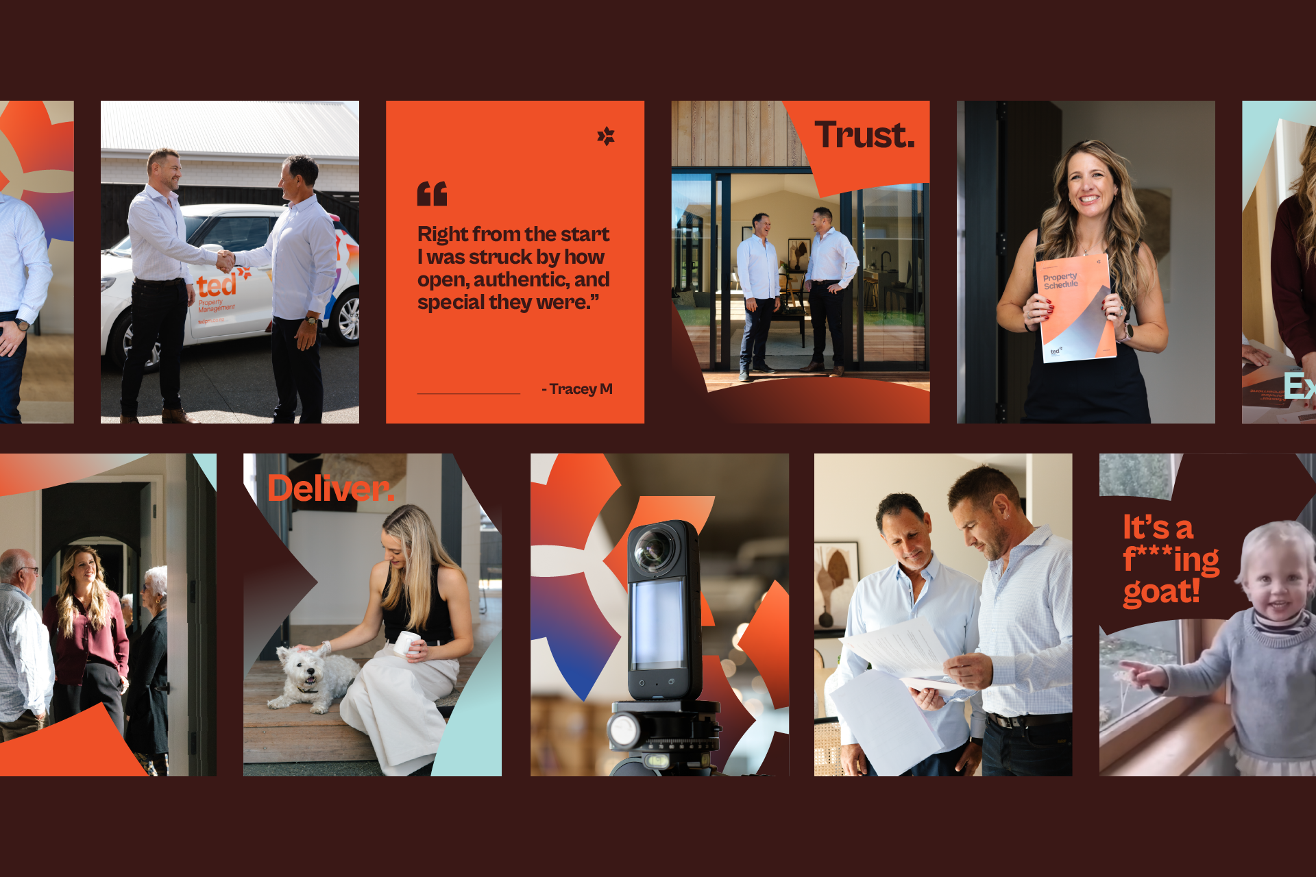
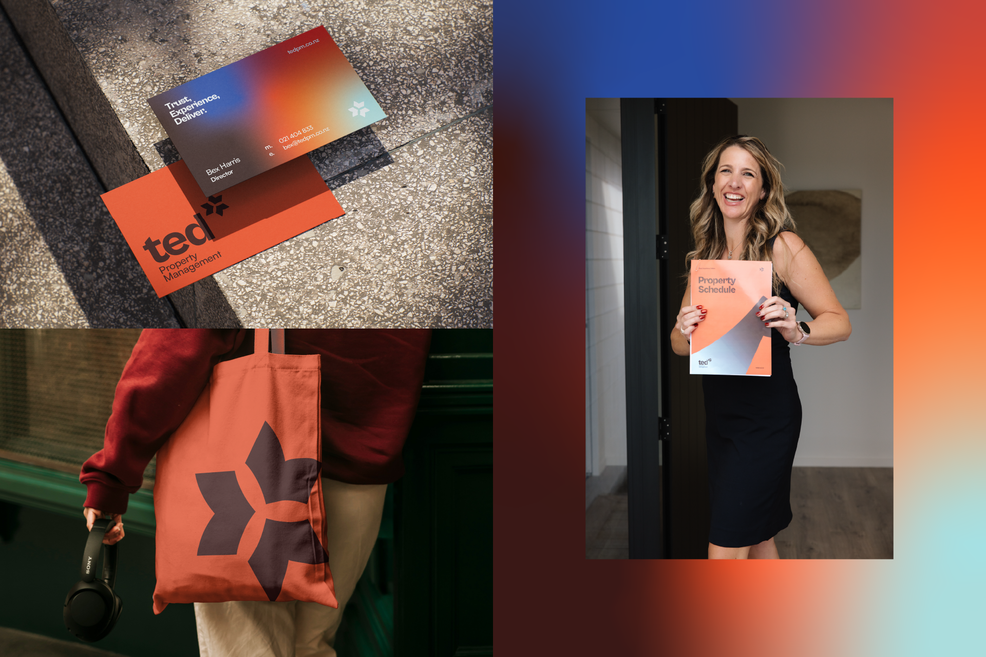
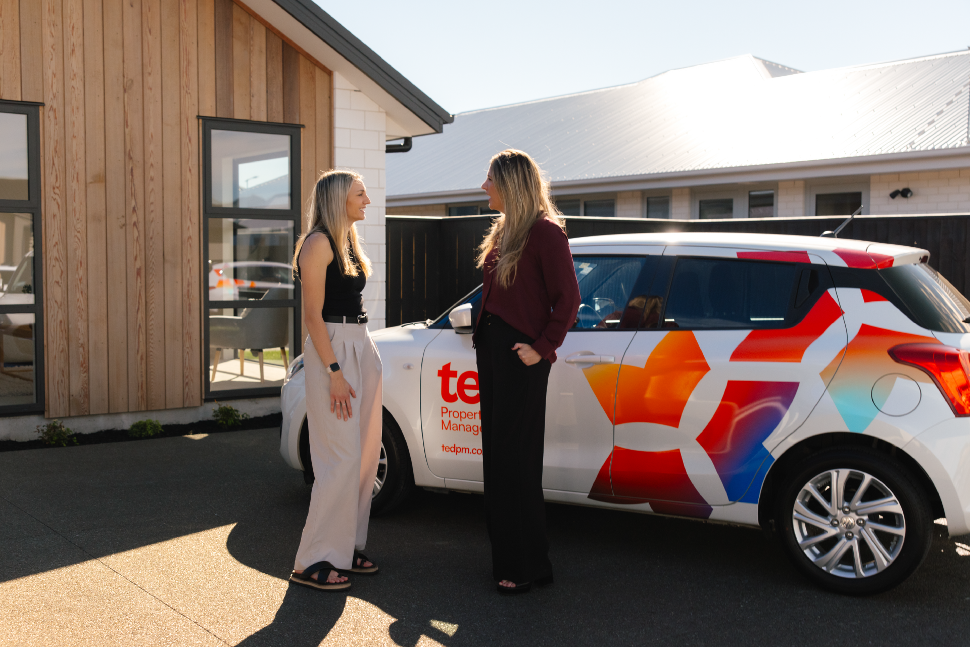
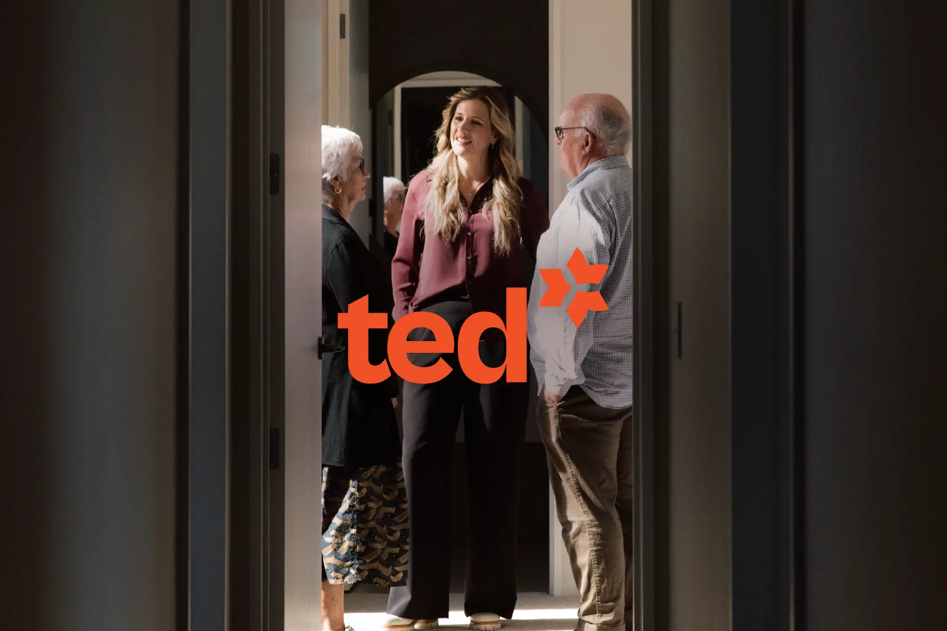
The TED identity is distinctive by design, standing out in a category crowded with bland colours and predictable messaging. Strong use of colour, typography, and graphic forms give the brand presence and personality. The identity system is anchored by the TED icon, which represents the coming together of three parts - owner, tenant, and property manager - and reinforces TED’s role in balancing the relationship.
More connection
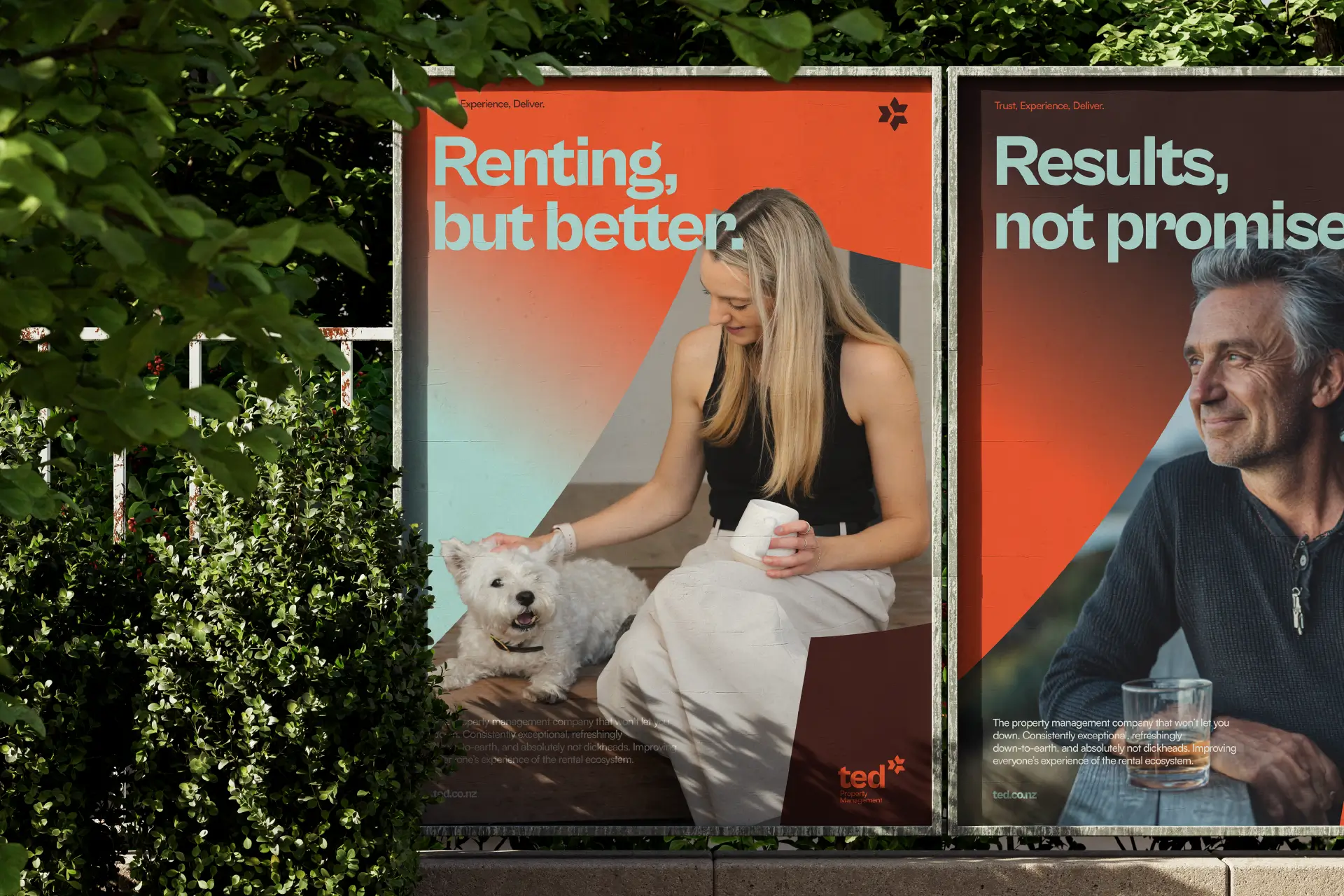
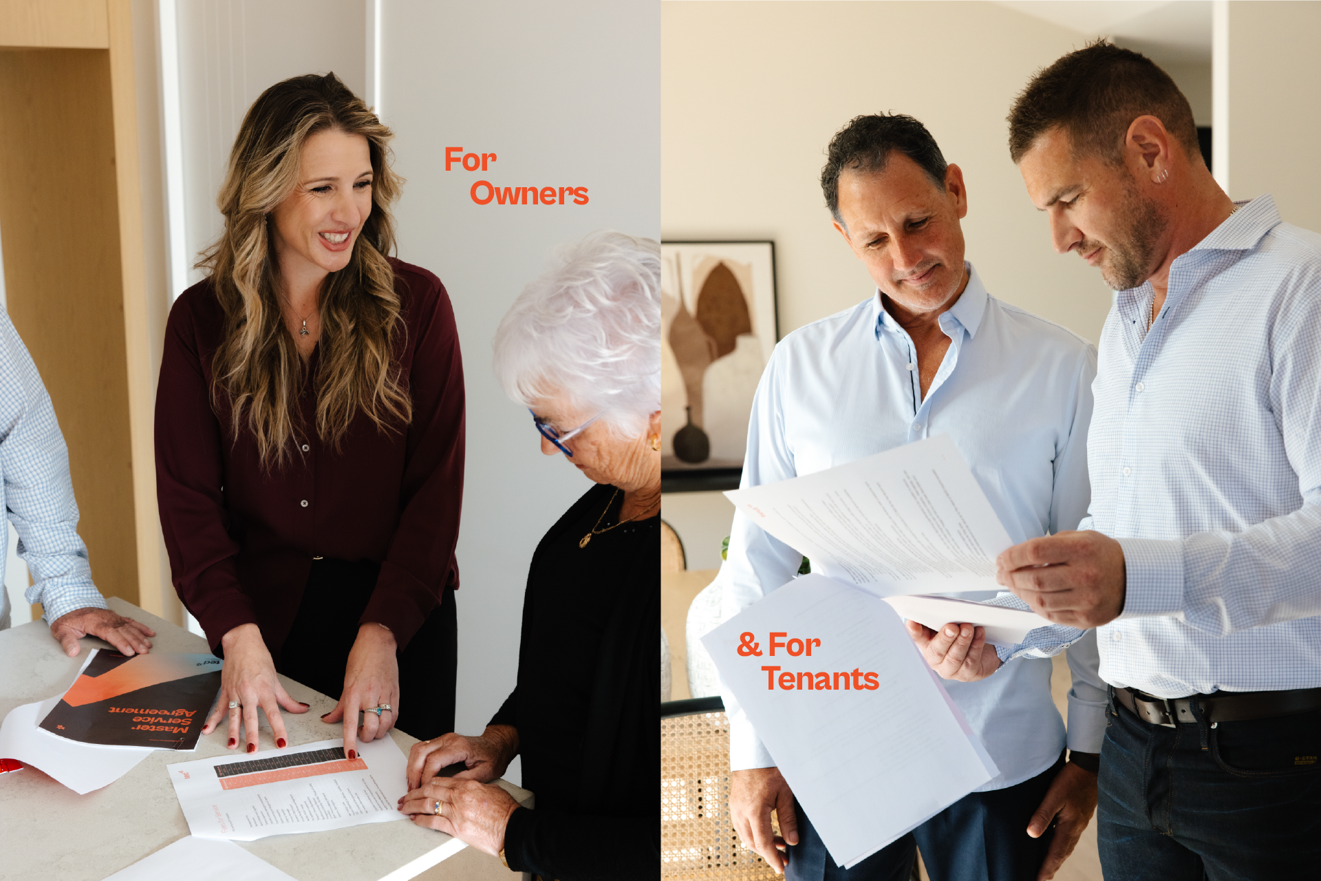
Photography and videography were a critical element of the brand communications. By featuring real people in authentic moments, TED’s visual assets underpin their commitment to empathetic, people-focused property management.
More confidence
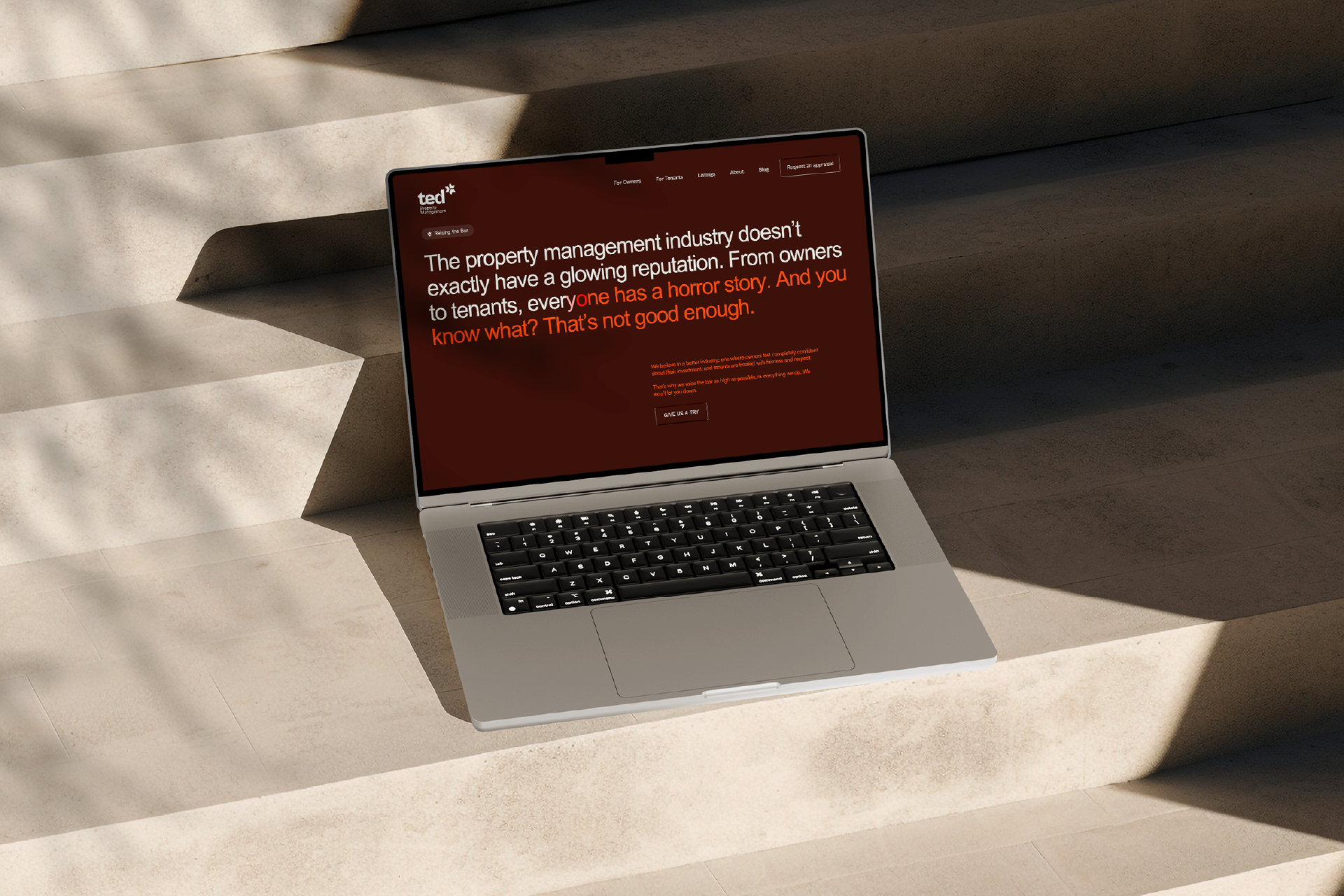
TED’s founders wanted to send a clear message: we’re here to raise the bar. Messaging such as “Results, not promises” and “Renting, but better” gives the brand clarity and backbone, while remaining relatable and down-to-earth.
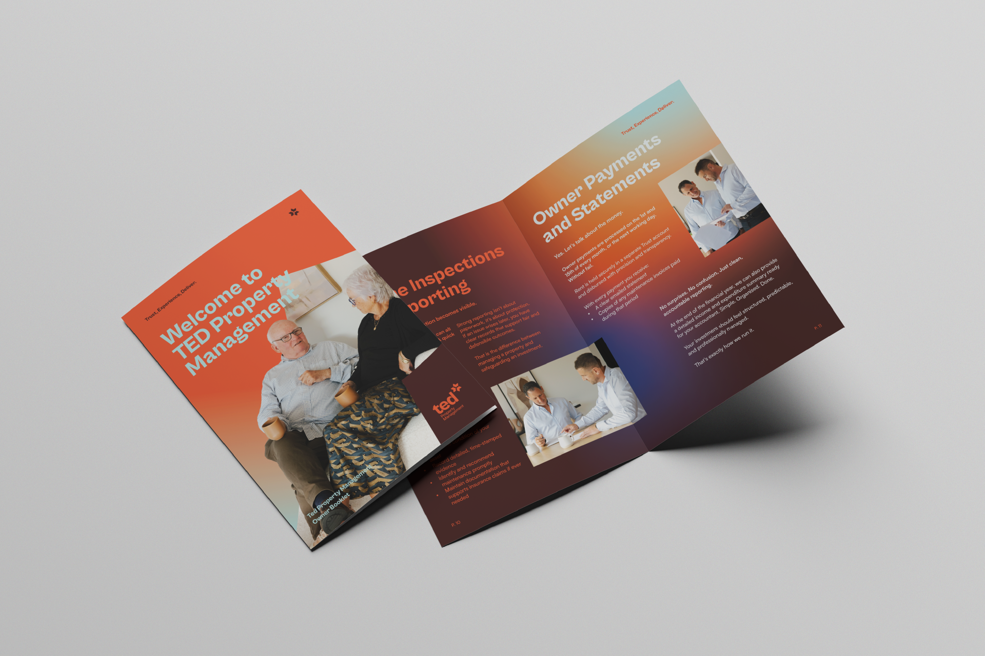
From business cards and documents to vehicle branding, website, and campaign collateral, every touchpoint reinforces the same idea: this is a brand with the expertise and confidence to uplift an industry.