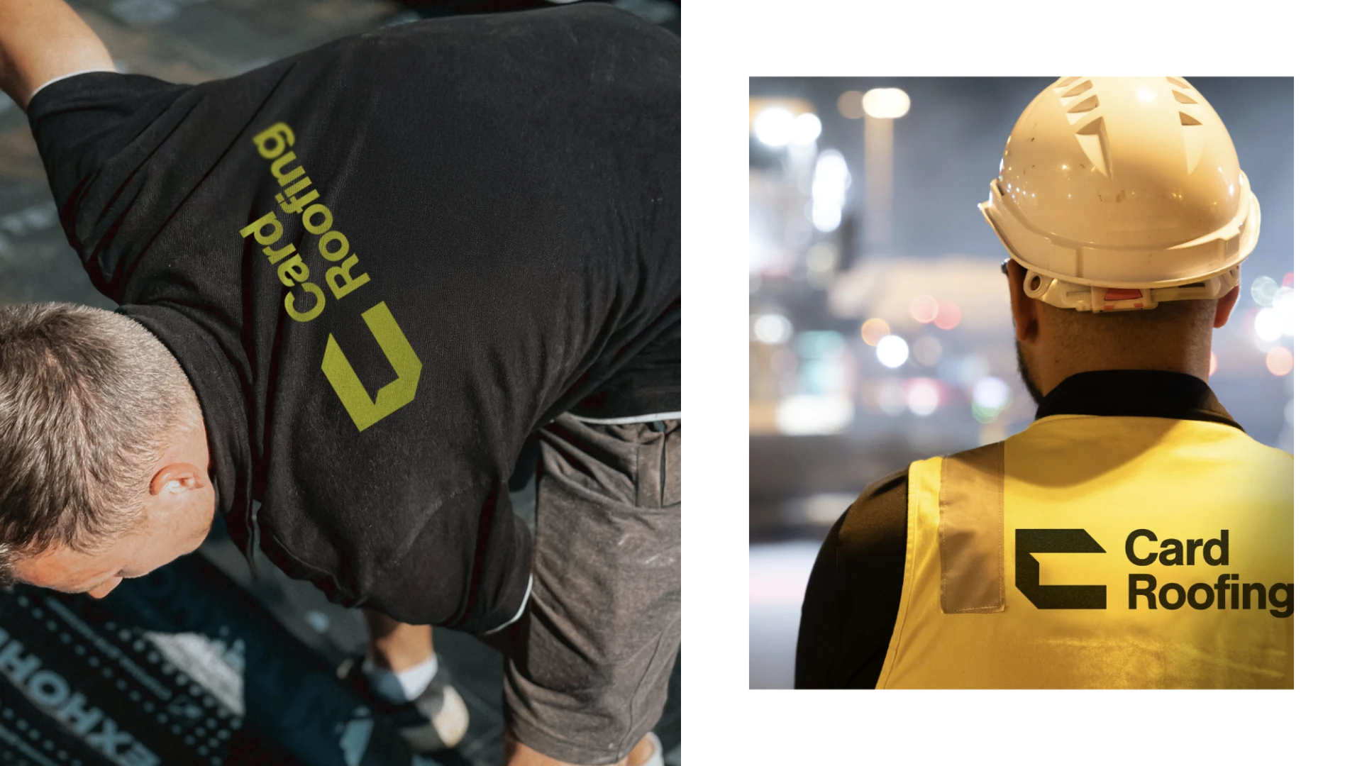
Card Roofing was already a familiar name in Christchurch’s construction industry, but as the company began pursuing bigger commercial projects, its presentation hadn’t kept pace with its capability. The team was in front of the right clients and winning the right projects, but their brand didn’t reflect the professionalism and scale of the business.
They needed a brand, website, and visual system that matched the quality of their work and reinforced the confidence clients already had in them.
More presence
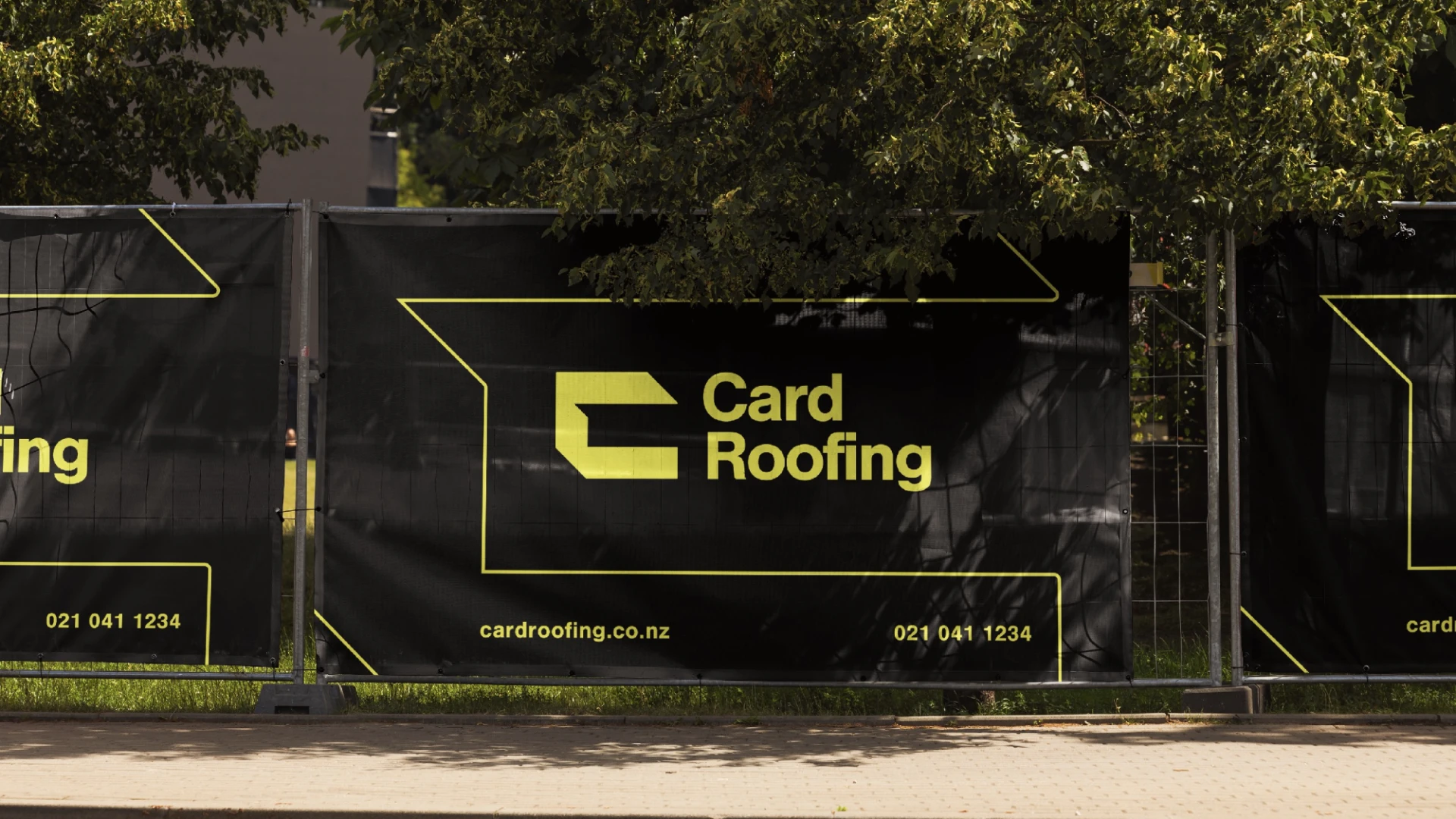
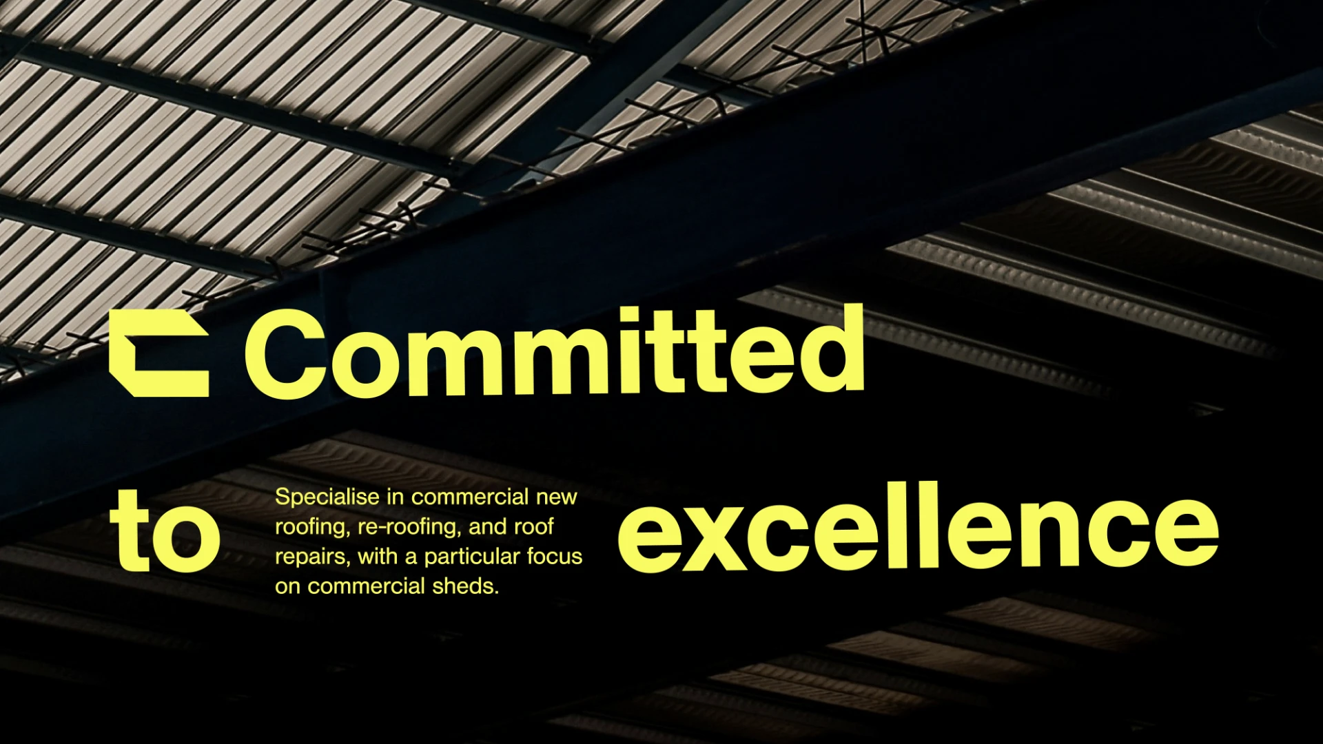
The refreshed brand is deliberately disruptive. The primary brand colour, Maximum Yellow, references the high-vis clothing seen across the trades and stands out in an industry that favours navy and dark red.
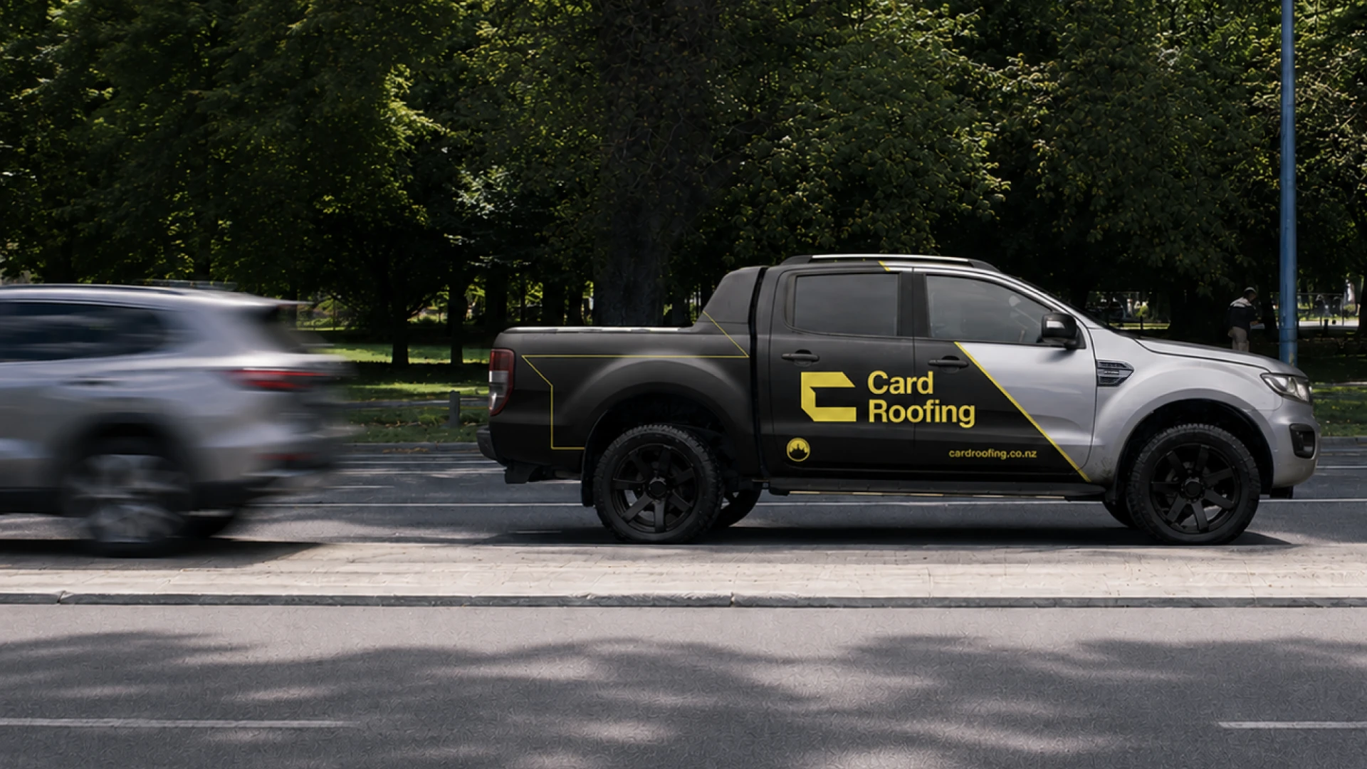
The logo is inspired by innovation and longevity, and features a custom icon shaped from geometric roof forms; it’s construction-inspired, but far from the house/roofline iconography that has become an industry cliché. And as the client said, “rectangular looks good on the ute”.
More polish
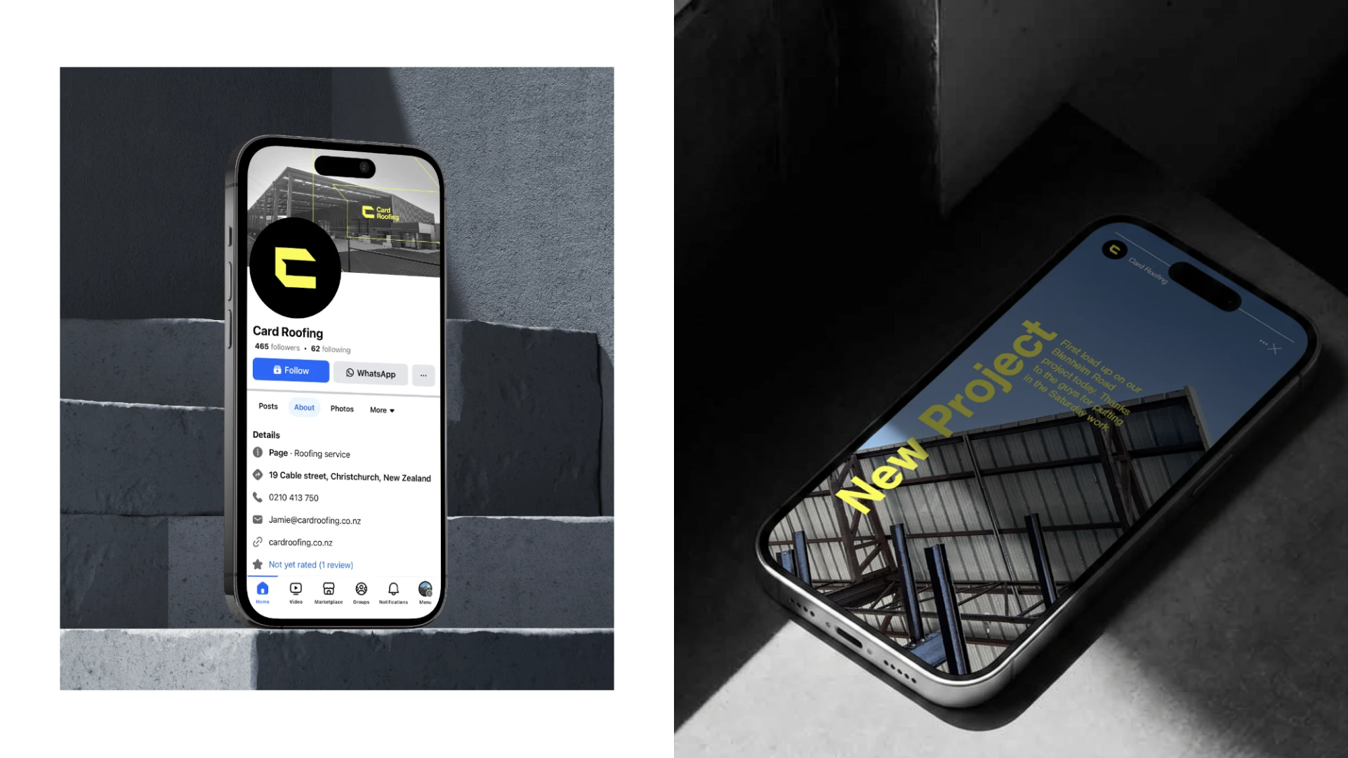
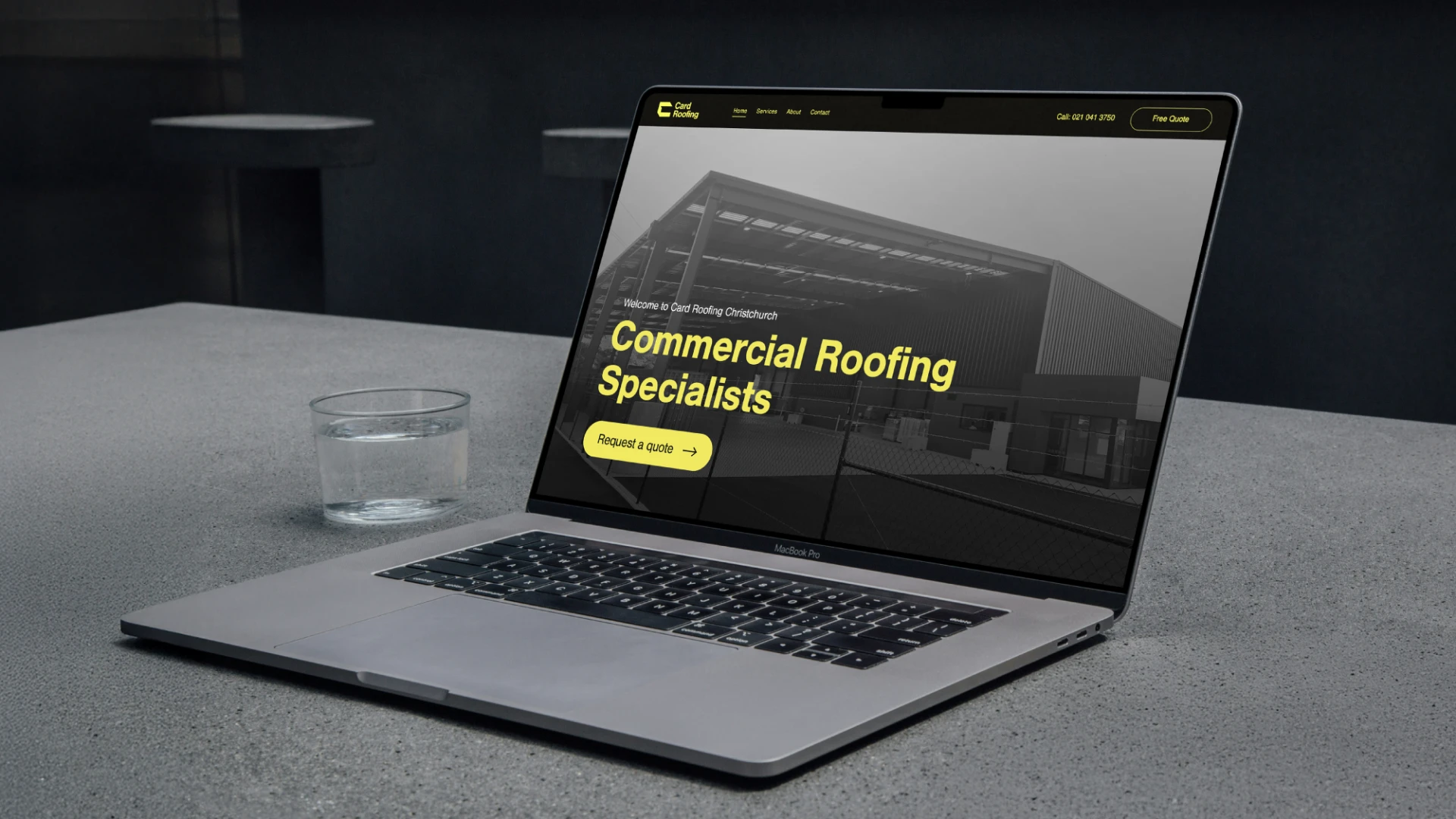
Card Roofing’s website was visually outdated and clunky to use, but the foundations were solid. Rather than starting from scratch, we refreshed what was already working: we migrated the website to a modern platform, applied the new brand, and refined the content and design. The result is streamlined and professional, compelling without becoming overcomplicated. New teamwear, site signage, and eye-catching vehicle graphics round out a brand that reinforces Card Roofing’s status as a professional, premium contractor.